
Ruminations on the Sunset
Visual thoughts inspired by Ridley Scott's Blade Runner.


As we discussed on this week’s Ancient Geeks (get it wherever you get your podcasts!), one of the things about the film that really appeals to me is its visuals. I am hardly the first person to note the beauty of the film, but as we go through our podcast journey of revisiting classics from our youth, one of the joys is seeing how a work that you have known for decades can grow or diminish upon repeated viewings. This is a movie that I have appreciated more each time I have seen it.
As I have noted more than once on the podcast, I am an avid photographer. I have dabbled all my life; indeed, I am ancient enough to have had a film period. But I have been especially serious about it for about fifteen or so years now.
This may be the first time I have watched this film since my deeper dive into photography, and certainly since I have become more conscious of things like blocking, lighting, lenses, etc. The movie does contain some of my favorite subjects/visual themes, including urban decay, contrast, wide shots, and how it uses lighting. Sunsets are also a favorite subject, and so that shot at the top is likely my favorite in the whole movie (the specific scene can be viewed here).
Not only is it a beautiful wide shot with a stunning view of the sun in late afternoon, but Tyrell’s office is simply a major contrast to the world of Los Angeles below. It is sleek and uncluttered, unlike the city streets, shops, and apartments we see in the rest of the film. It is also a vast space with three people (and a very expensive, artificial owl), a direct contrast to the overpopulated streets we see in much of the film. Also, there is no rain, but instead sunlight—the only sunlight, I think, that we have in the film.
I also appreciate the shadows, contrast, and golden hues (unlike the blues and browns down below). In terms of the movie’s color palette, I would recommend these posts by Flooby Nooby: Composition & Color Analysis of Blade Runner (1982) and The Cinematography of “Blade Runner”.
I imagine the Pacific is in the distance, but I would again note, as I did on the podcast, that the absence of the ocean in this film continues to strike me, given its setting. Speaking of the Pacific, here’s a shot that I took over the Pacific in Goleta, CA, in April of 2023, which evokes the sun’s position, and some of the hues from the still above.
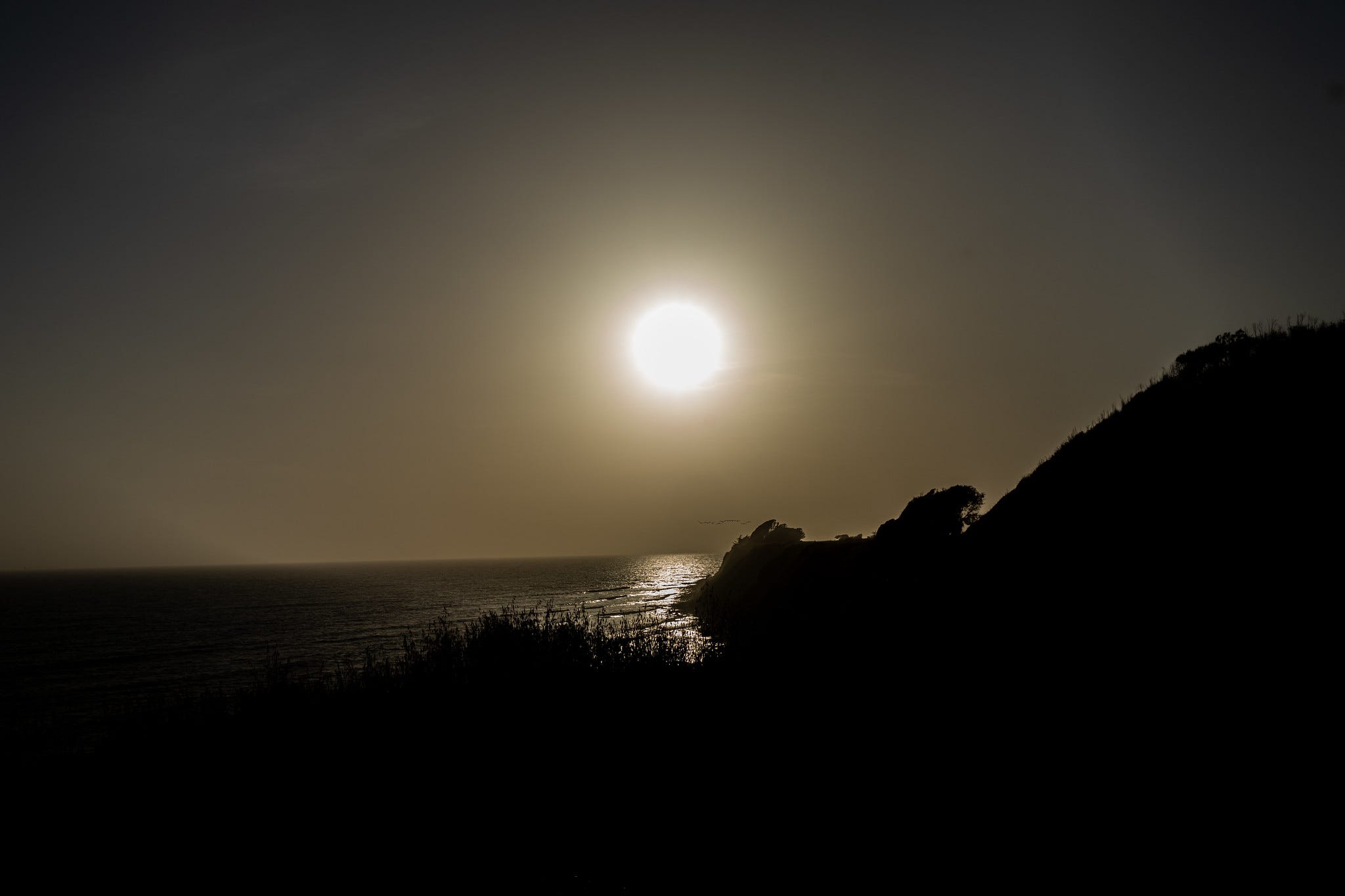
One of the great things about a sunset is that it is a varied event, differing daily based on time of year and especially based on clouds and other objects that might be present. It represents an ever-changing display of light and its effects, which is the very foundation of phorography. In the shot from the film, for example, the geometric shapes frame the descending orb.
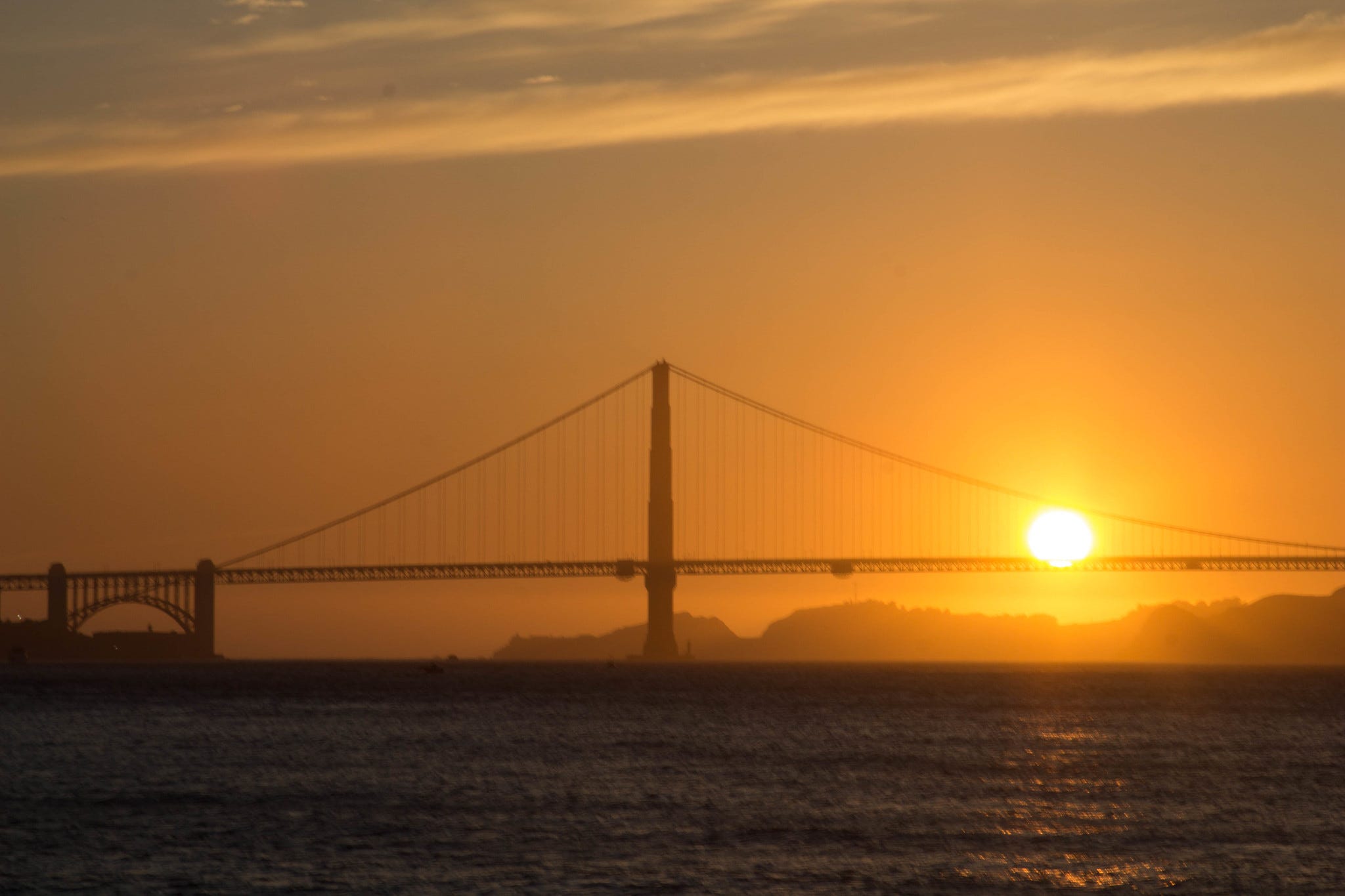
Objects in the foreground can often be quite effective. For example, San Francisco in 2015.
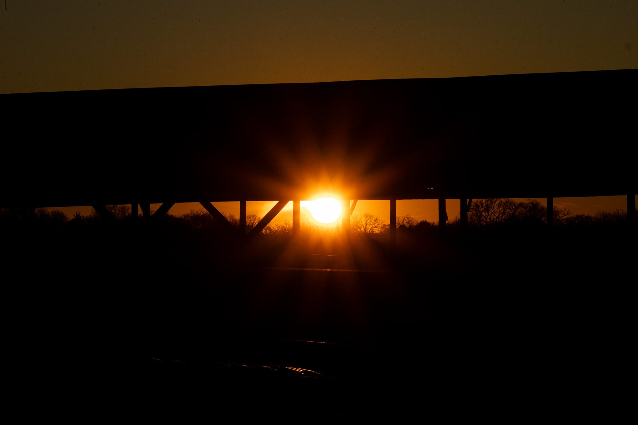
A more rural setting in 2024.
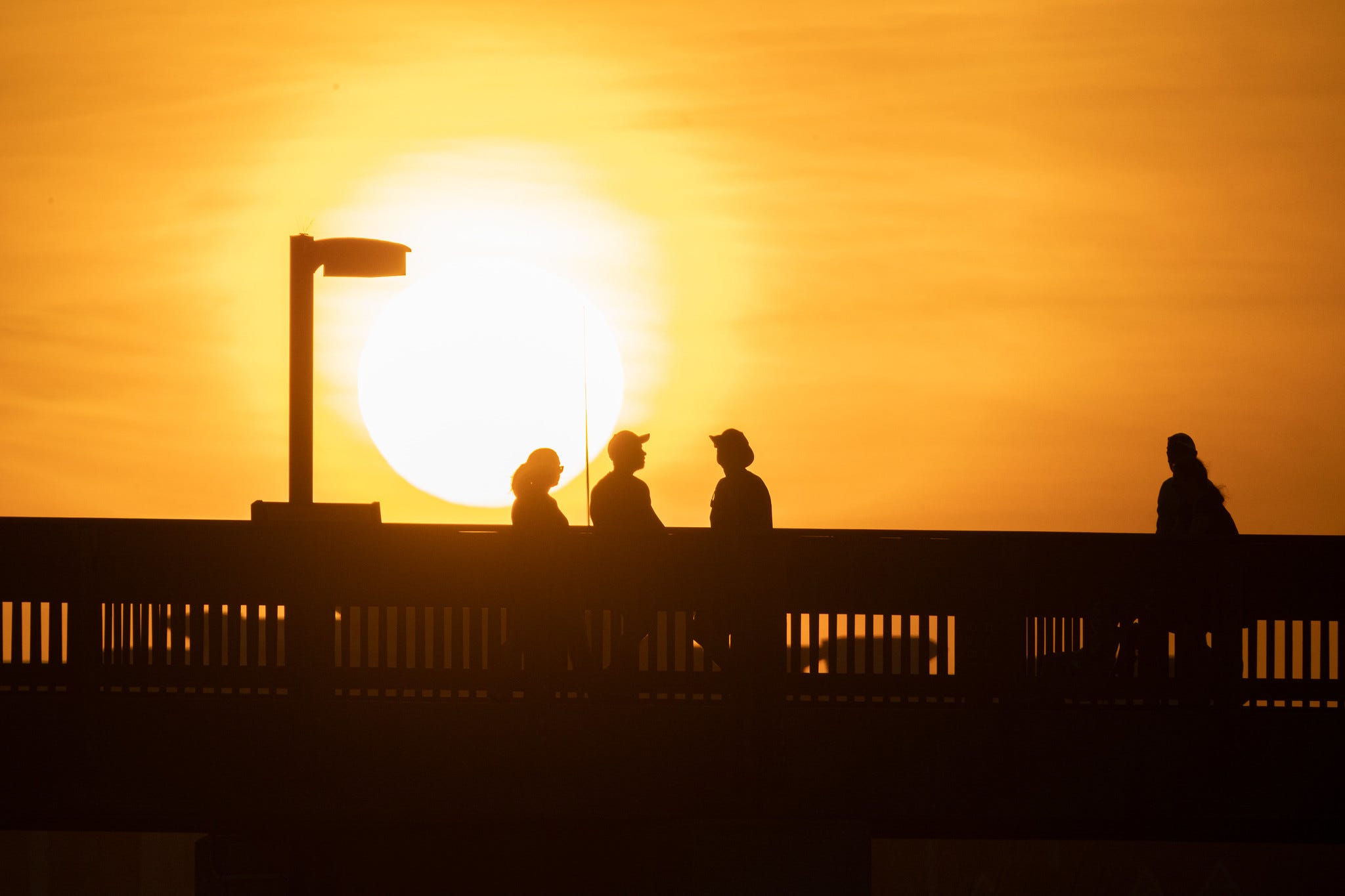
The Gulf of Mexico in 2025.
I could go on, but have already been self-indulgent enough.
Here are a few more of my other favorite stills from the film.
Here we see a lovely use of contrast, light, and color (as well as providing some world-building via visuals with the flying car and the massive video billboard).

Here are several examples of the prevalence of blue light down at (or near) street level.
")
 Wallpaper ...")
And, of course, the entire “tears in the rain” scene, which can be watched here.
I will include this shot as well, although the quality of the still diminishes the shot (I could not find a better one to my liking), but the composition is worth highlighting.
 | The Independent | The Independent")
At any rate, Scott’s vision as a director and the skills of cinephotographer Jordan Cronenweth are impressive and have more than stood the test of time for this Ancient Geek!
 | A guest post by
|
As we discussed in the podcast, Ridley Scott and the cinematographer, Jordan Cronenweth, most definitely made photographic choices that were inspired by, and were intended to evoke, the classic film noir visual style. For example, the light/dark contrasts in Deckard’s apartment and Tyrell’s ziggurat, looked straight out of movies like Double Indemnity and The Third Man (though in color rather than black and white). At the same time, there’s something distinctly Ridley Scott-ish about the cinematography, including the use of a particular color palette, that looks consistent across early Scott efforts like Blade Runner, Alien, and The Duelists. All three movies had different cinematographers, so you can say for sure that whatever consistency there is among them, Scott bears a lot of responsibility for that look.
I’m not throwing out these observations just to be a movie-making nerd, on top of an ancient geek. It’s these touches that make these movies exceptional, especially for their time. If you had the very bright lighting of a lot of geek cinema of that era (see, for example, the movie The Changeling, which looks like it was filmed with klieg lighting from every possible direction), they would have been far less effective as movies, having less impact on cinema than they did.
Must be my (and plenty other people’s) favorite movie. Seen it countless times since opening week (I was one of only 4 people in the cinema). The cinematography, composition, art direction marry beautifully to the best score/soundtrack ever by the wondeful Vangelis.